


V-CONNECT COURSE DELIVERY PLATFORM REDESIGN
ROLE
UX Design + Research
TIMELINE
3 months
STATUS
Product Launched
THE QUICK VIEW
STARTED AS
Complicated Internal B2B Tool
Research
Diagnosed that the problem was structural, and not visual
Design
Redesigned user workflows to be simpler and more efficient
Iteration
Incorporated feedback from usability testing and stakeholders
Dev Collab
Continuously worked with development team till product launch
SHIPPED AS
Live product now with 30+ corporate clients
PROBLEM
V-Connect was Potentia's internal course delivery platform, built for their own instructors and never meant for outsiders. When Potentia decided to sell it as a standalone product, the problem became impossible to ignore.
The platform only made sense to the people who had already spent years inside it.
New users called back constantly. Even client HR managers who had been granted partial access needed hand-holding through basic tasks.
Veteran facilitators had built mental models over years of repetition that made the system feel natural to them. For anyone coming in fresh, those same jumps were walls.
INSIGHTS
I focused on existing internal facilitators, aka the people who knew the system best. My research questions focused on identifying where the friction actually lives, and what invisible knowledge would a new user have no access to?
“Despite using this for years, I still get lost sometimes and need to find my way back. I basically just have a bunch of routes memorized that I use when I need to finish a task”
- Facilitator who had used the product for 3+ years
Three findings shaped everything that followed
01
BATCH CREATION WAS ERROR PRONE AND COGNITIVELY DEMANDING
No clear structure through the multi-step process. Users relied on verbal knowledge passed down. For every new user, even one wrong step meant starting over or calling someone.
02
LARGE UNSTRUCTURED FORMS OVERWHELMED USERS
No hierarchy between required and optional inputs. Users stalled, skipped critical fields, or guessed with no recovery path when they got it wrong.
03
DENSE, INCONSISTENT INTERFACE MADE SYSTEM NAVIGATION HARD
Long text-heavy tables with inconsistent visual patterns made it impossible to get an overview at a glance. Users couldn't find the information needed quickly
If we were selling this to people who had never touched it before,
no amount of visual cleanup was going to fix a broken process.
DESIGN DECISIONS AND WHY?
SCATTEREED PAGES
→ GUIDED FLOW
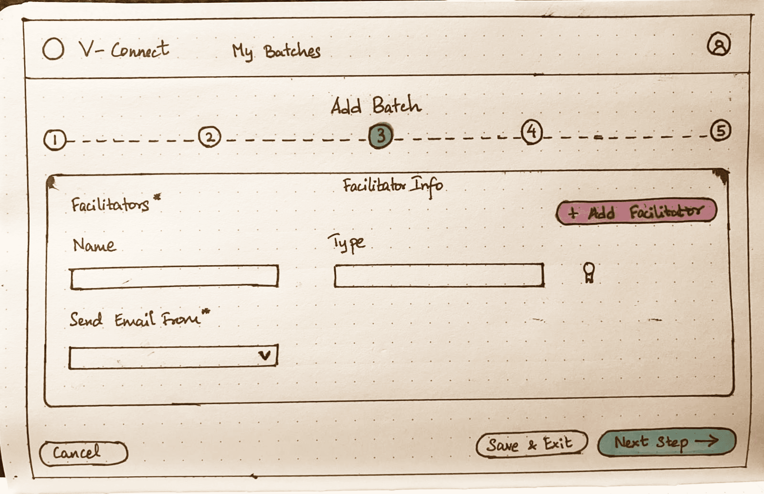
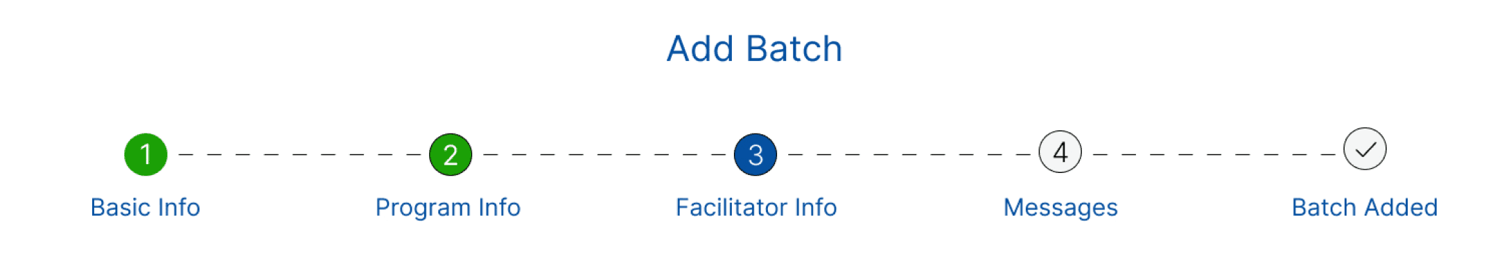
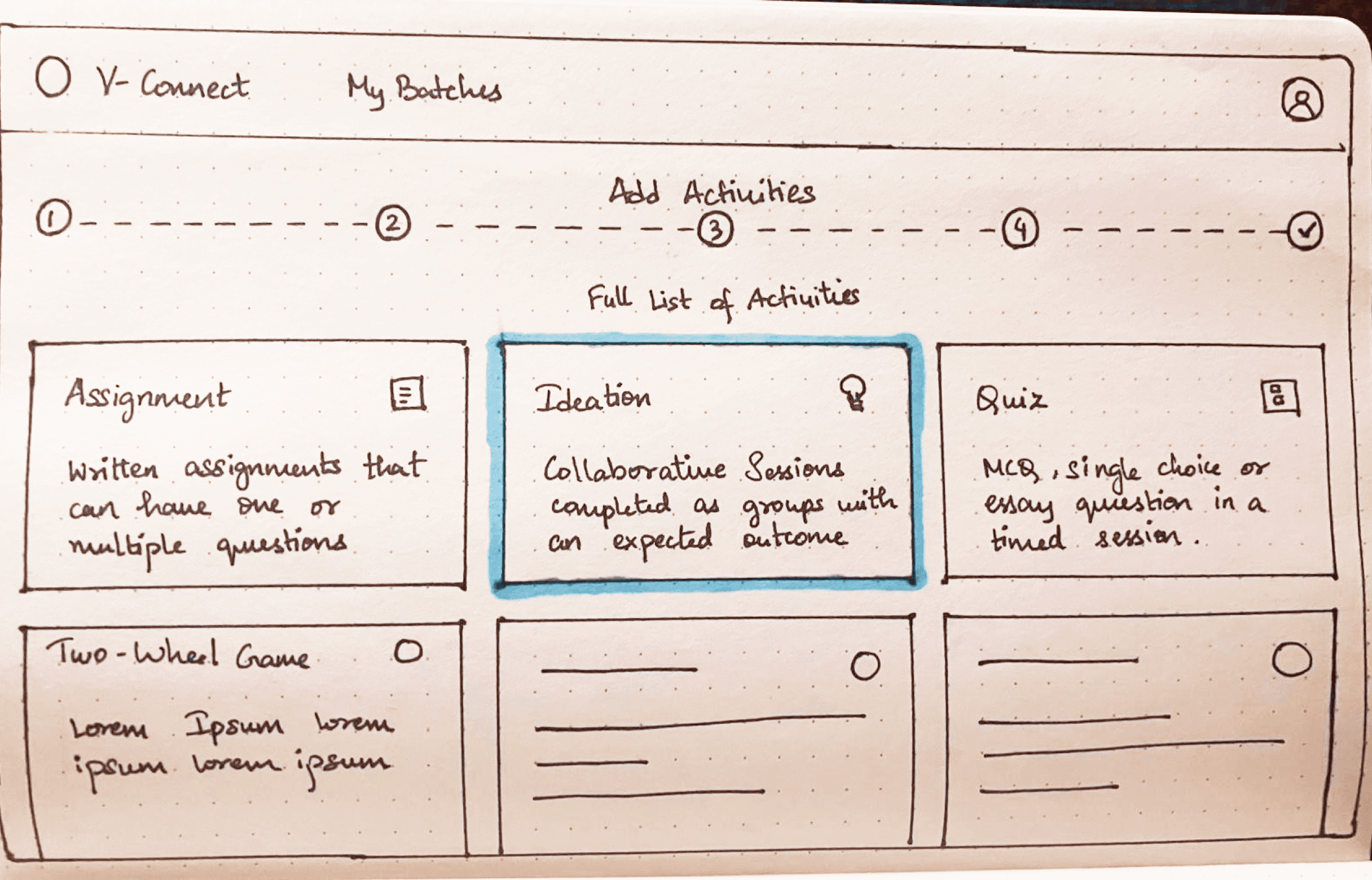
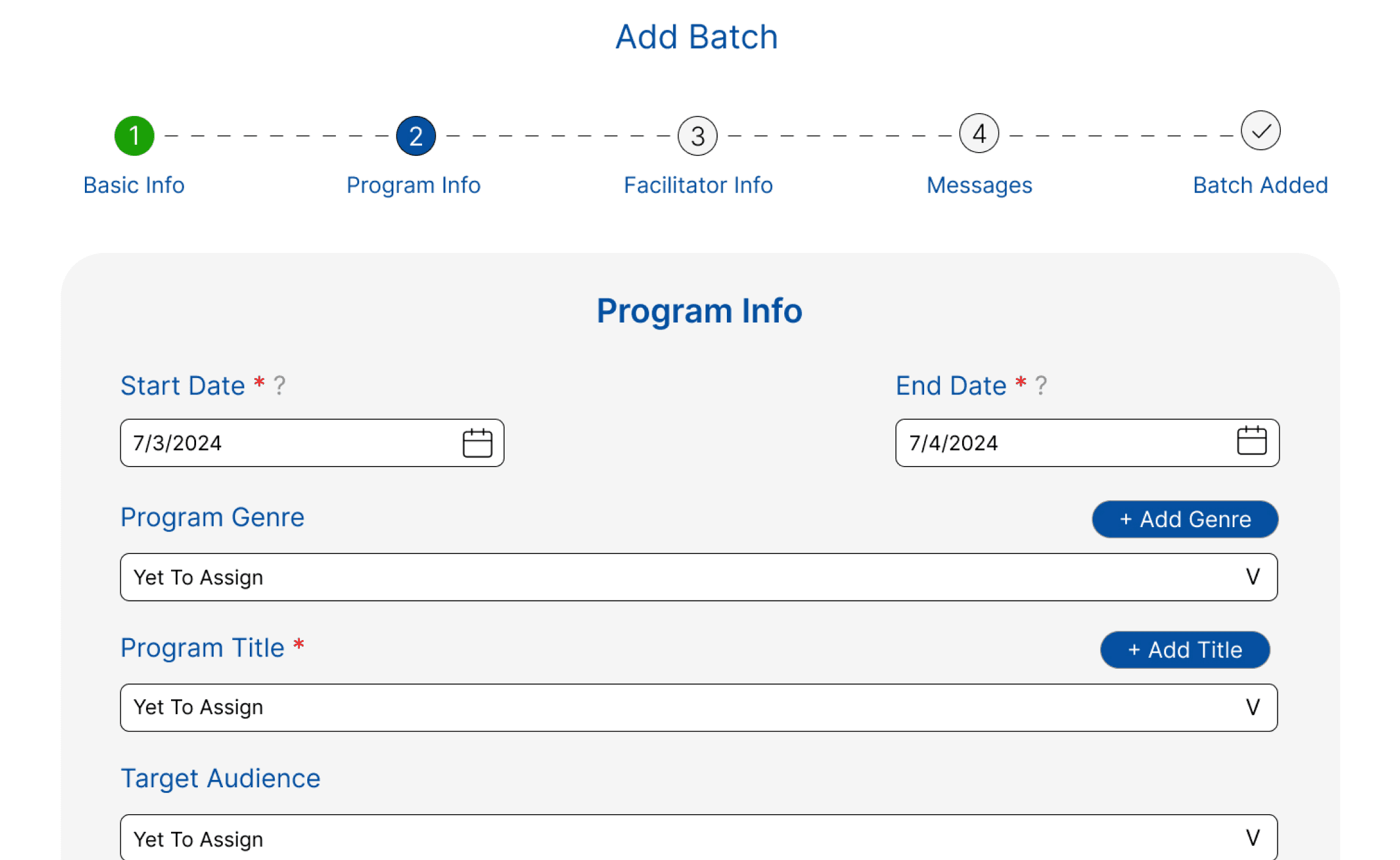
Before touching any individual screen, I mapped the entire task flow and rebuilt the sequence from scratch. Batch creation was the most cognitively demanding part of the product. Facilitators navigated between disconnected pages with no sense of where they were or what came next. The fix seemed obvious: a linear step-by-step flow with clear progression indicators at every stage.
INITIAL IDEA
A user flow restructured to have a linear process:
Create Batch → Add activities → Add participants → Publish
PUSHBACK
Facilitators flagged that one of V-Connect's actual strengths was the ability to add activities and participants in parallel or in alternating order. Facilitators relied on this flexibility yet the linear flow removed that feature.
RESOLUTION
The step-by-step structure stayed, but the progression model changed. Instead of moving users forward automatically, the guided flow became a choice-based navigation process where facilitators choose what they want to work on next, and the following screens adapt based on that. First-time users get structure and clarity while users who know what they're doing keep their flexibility.


Optional shortcuts for experienced users
Progression indicators within each step
New Batch
Step-by-step guided flow where you choose your own path, instead of a fixed sequence
ITERATION 2
REDUCING COGNITIVE LOAD IN FORMS
Some of the most-used forms in V-Connect had upwards of fifteen fields on a single screen, with no distinction between what was required and what wasn't.
I broke any form above a certain input threshold into staged steps.
INITIAL IDEA
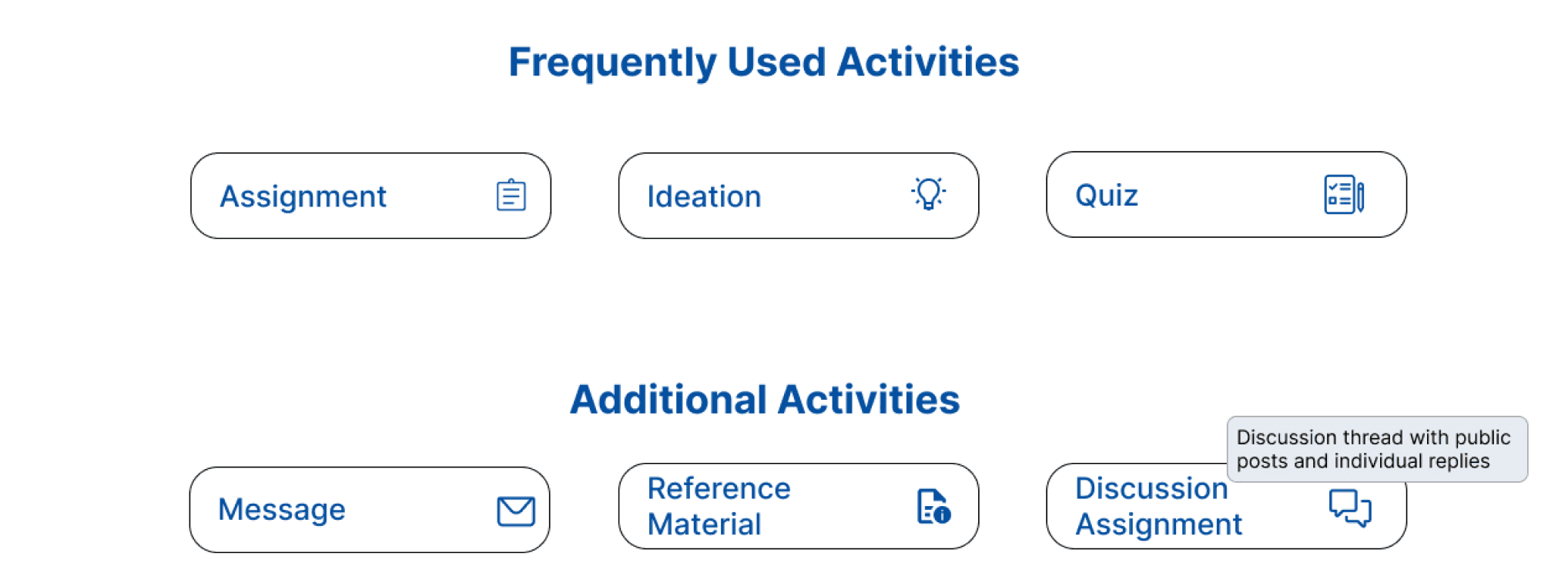
I broke forms into staged steps and updated internal jargon to be more explicit, adding contextual help throughout, visible all the time
PUSHBACK
Stakeholders felt the help text was clutter and unnecessary for anyone who knew the system, taking up valuable screen space.
RESOLUTION
I kept the clearer language but made help text collapsible and tooltips hover-triggered. Users who need context get it instantly. Users who don't can ignore it entirely. Neither group compromises.
Required vs Mandatory made clear
Collapsible functionality to reduce overwhelm
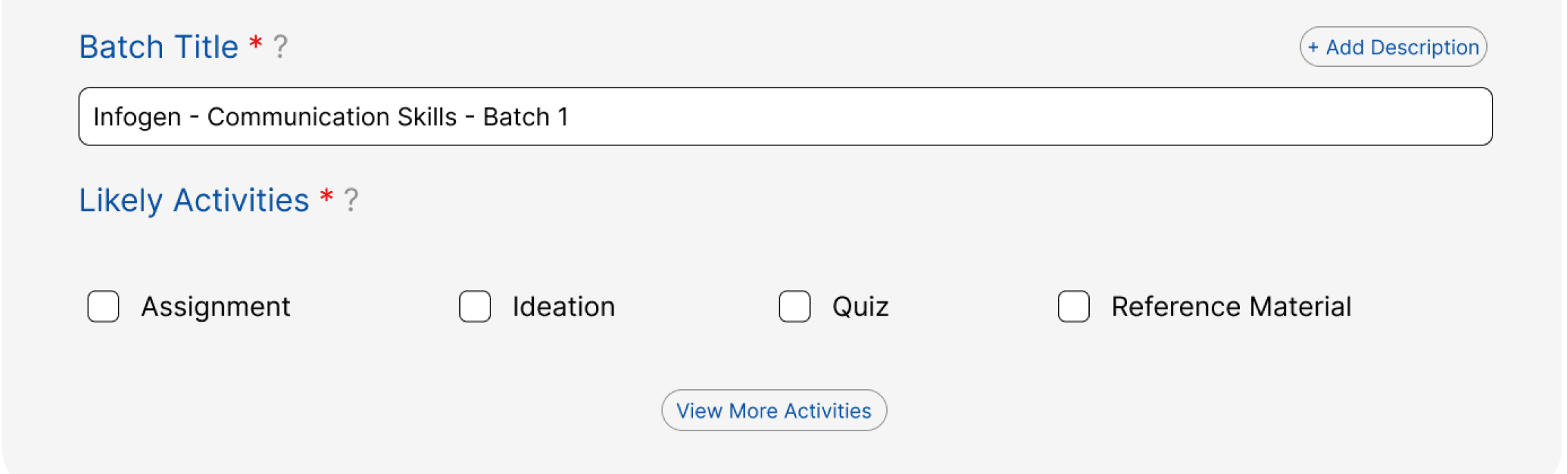
Suggested defaults reduce decision fatigue
Contextual Guidance on hover
Discussion thread with public
posts and individual replies
MAKING INFORMATION DIGESTIBLE
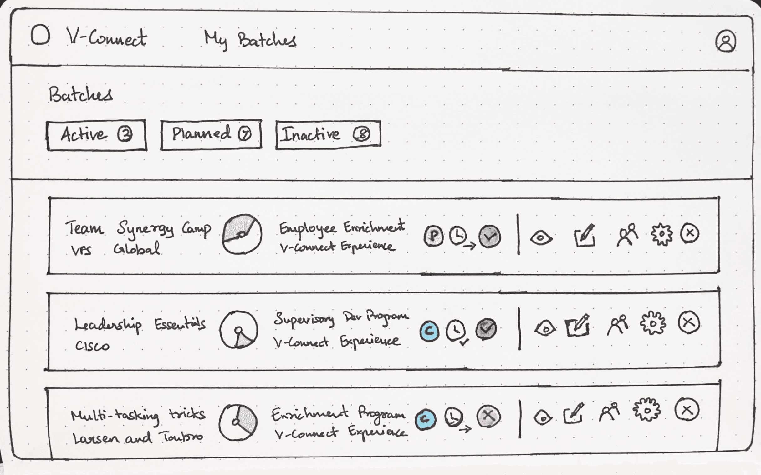
The batch list cards were carrying too much at once including the status indicators, progress metrics, facilitator roles, and action buttons all competing for the same space. Clickable and non-clickable elements lived side by side with no clear distinction between them.
INITIAL IDEA
I converted the text-based info into icons and added a divider between informational icons and action icons to create separation.
FEEDBACK FROM USABILITY TESTING
It was still taking too much space, and the team pointed out that not all that information was needed on first glance since users scanning their batch list were looking for specific things, not everything at once.
RESOLUTION
I stripped the cards back to only the information users actually needed immediately, paired with the action icons. Everything else like the status of publishing, scheduling info, etc moved into the filtering and sorting system. Information you need when scanning lives on the card while information you need when you're looking for something specific lives in the filter. The cards got cleaner, and the filtering became genuinely useful rather than decorative.
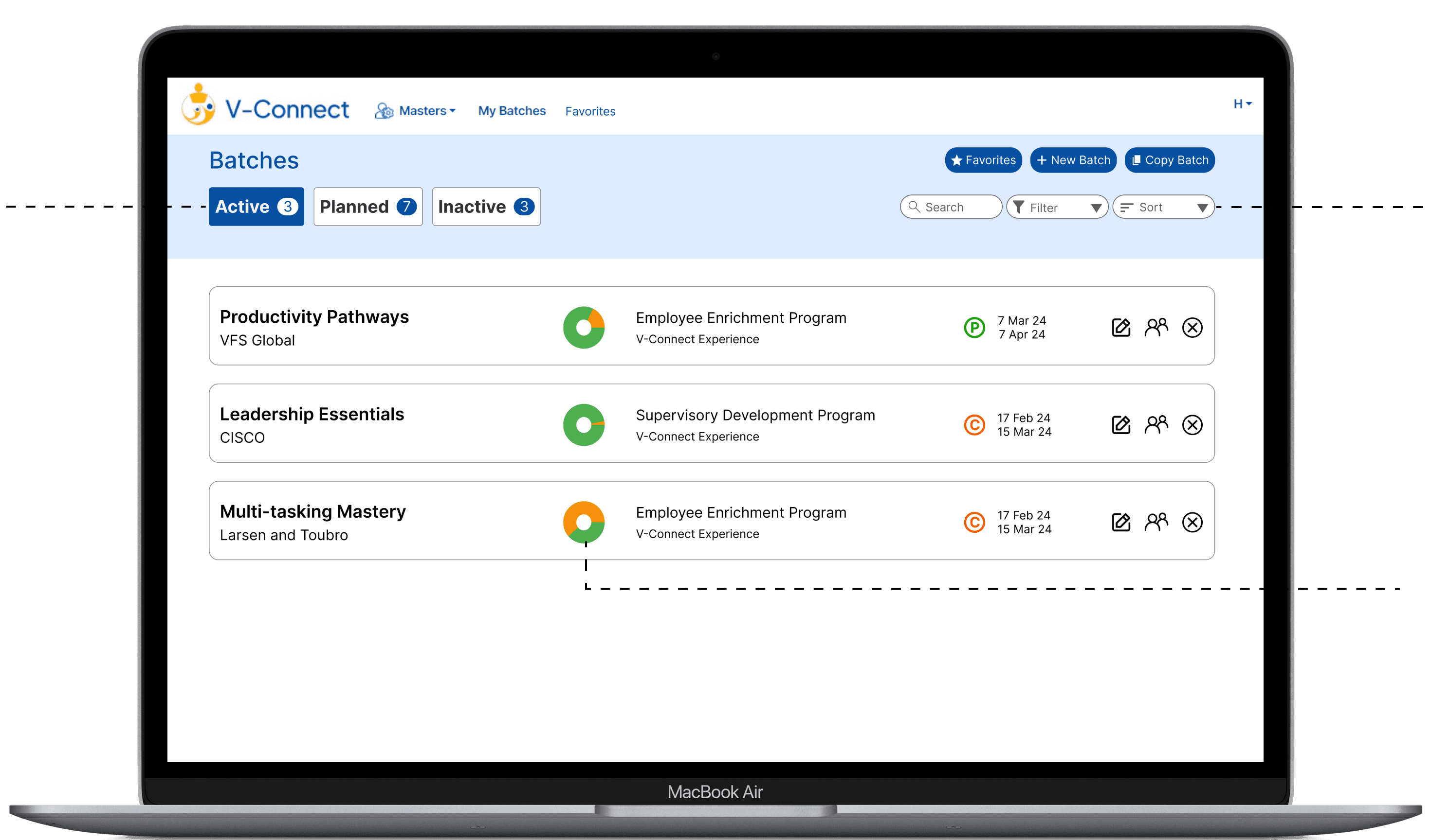
Search, filter, and sorting for info not in cards
Horizontal tabs to make large data sets navigable
Data visualizations replacing text heavy indicators
Only essential info visible on cards with detailed info moved to filters
Search
Filter
Sort

OUTCOME
V-Connect launched to market and is now live. 30+ client companies. 70+ course batches delivered. 1,800+ participants through the platform. A tool that once required an internal expert to navigate is now being used independently by people who had never seen it before.
30+
CLIENTS
1,800+
PARTICIPANTS
70+
COURSE BATCHES
REFLECTION
While the road to the final designs involved countless iterations and feedback sessions, the final product conveys the benefits of actively listening and incorporating feedback throughout the UX lifecycle. Redesigning the system and process instead of the visual interface reenforced the need to view products from a wider lens than only design and further intrigued me towards system based UX instead of visual based UX.
What shipped was meaningfully different from what I inherited.
PROBLEM
RESEARCH
DESIGN DECISIONS
OUTCOME
REFLECTION