
DESIGNING OTC MEDICATION ASSISTANCE TOOL
ROLE
Lead Research + Sole Designer
STATUS
Paper under review @ AMIA 2026
COLLABORATORS
UMD + Yonsei University + FDA
TIMELINE
Phase 1 complete
PROBLEM
The FDA Drug Facts label is the primary mechanism for communicating OTC medication safety in the United States. It lists active ingredients, warnings, dosing instructions, contraindications, and interaction risks. It is standardized and comprehensive but for older adults navigating polypharmacy, cognitive load, and limited health literacy, it is largely unusable.
A medication decision for this population isn't "read the label." It's a staged reconciliation: Do I even need medication right now? Is this product safe given everything else I'm taking? How do I dose it without harming myself over time? The label presents all of this simultaneously, in dense text, in small print, with no sense of sequence or personal relevance.
THE CHALLENGE
The goal was to convert the static drug label into a process-based interface that maps to how older adults actually make decisions and not how the label assumes they do, in collaboration with Yonsei University and the U.S. Food and Drug Administration.
With one hard constraint that shaped every design choice: nothing on the label could be removed.
THE PROCESS
BEST PRACTICES FIRST. REAL USERS SECOND. REDESIGN THIRD.
Considering older adults managing multiple conditions, caregivers coordinating medications, etc, the stakes were too high and the domain too sensitive to test half-formed ideas. So we decided to build responsibly before initial testing
THE GOAL
Enable older adults to independently make safe decisions regarding OTC meds
Best practice driven research
Using existing literature on designing for older adults to inform design
App Design + Build
Converting drug label information into a user flow adhering to FDA guidelines
Interview + Usability Testing
Conducted rigorous contextual interviews and usability tests
Analysis + Findings
Thematic synthesis of findings about OTC decision making to inform redesign
CURRENTLY AT
Phase 2: Redesign
The design foundation came from the below three sources:
FDA
restrictions, labeling and guidelines
RxNav
Drug interaction database
Literature
on designing for older adults
A mixed methods study was conducted with 17 participants (Older adults and informal caregivers of individuals with cognitive impairment)
Contextual interviews: Real-world OTC decision-making behaviors
Usability testing (4 tasks): think-aloud protocol evaluating the app
Surveys: SUS and SEQ
I conducted 7 of the sessions. Interview and usability data were analyzed separately, then synthesized to connect real-world behavior with in-app interaction patterns to inform redesign.
DESIGN DECISIONS AND WHY?
CONVERTING A
DRUG LABEL INTO A PROCESS
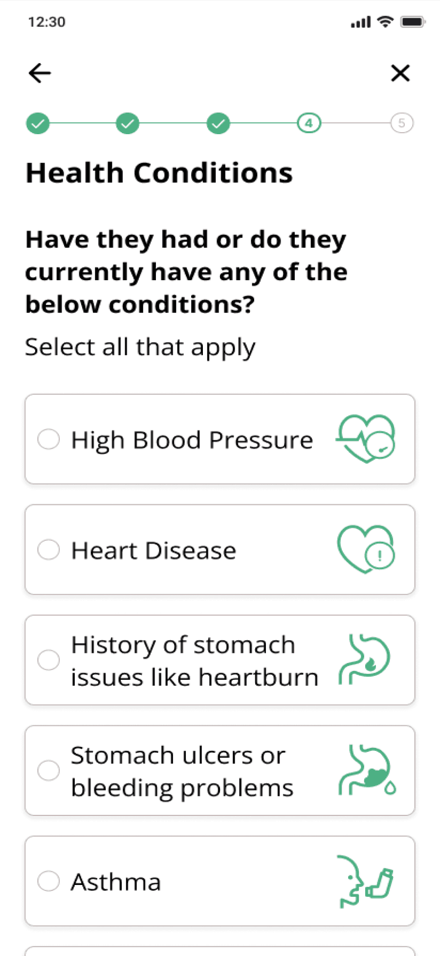
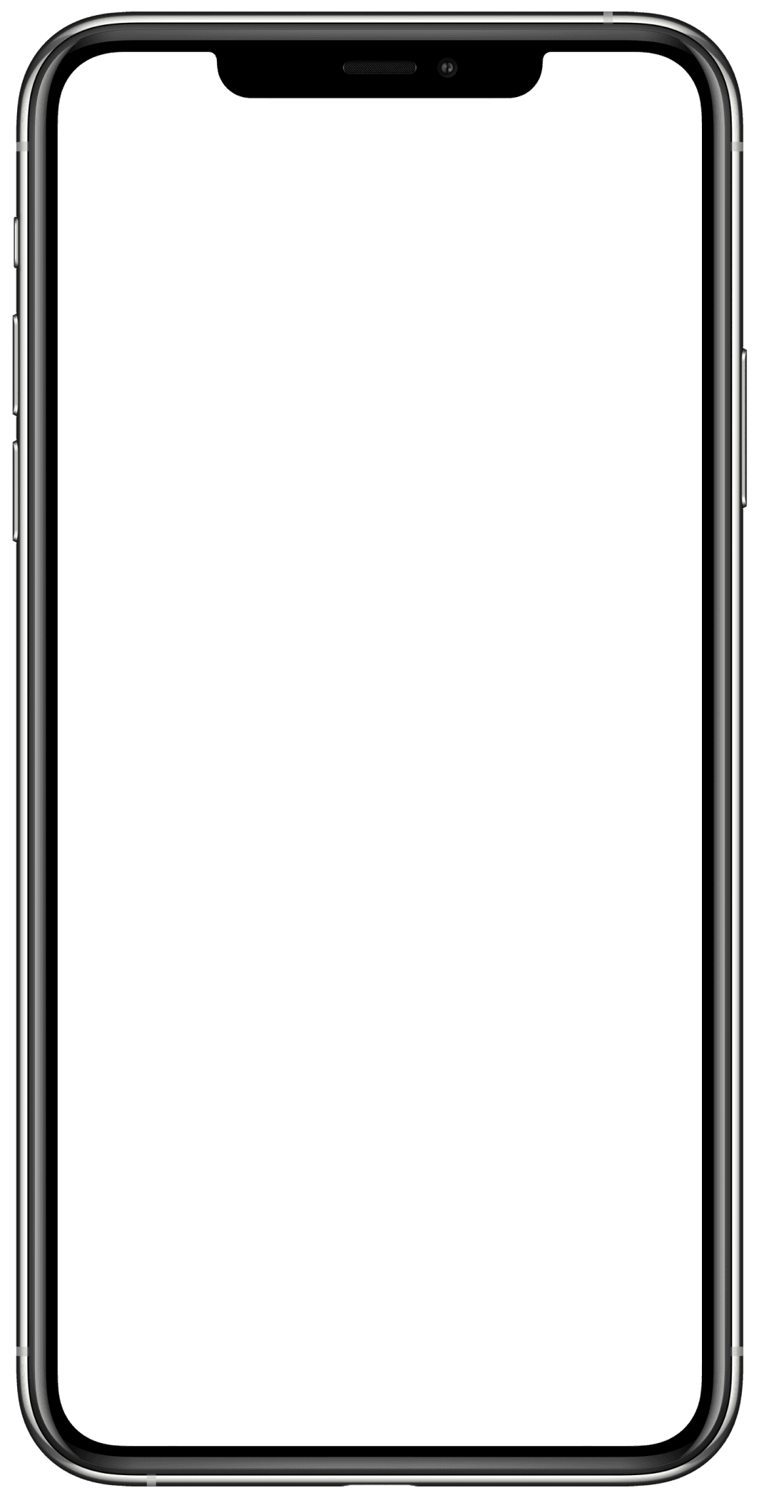
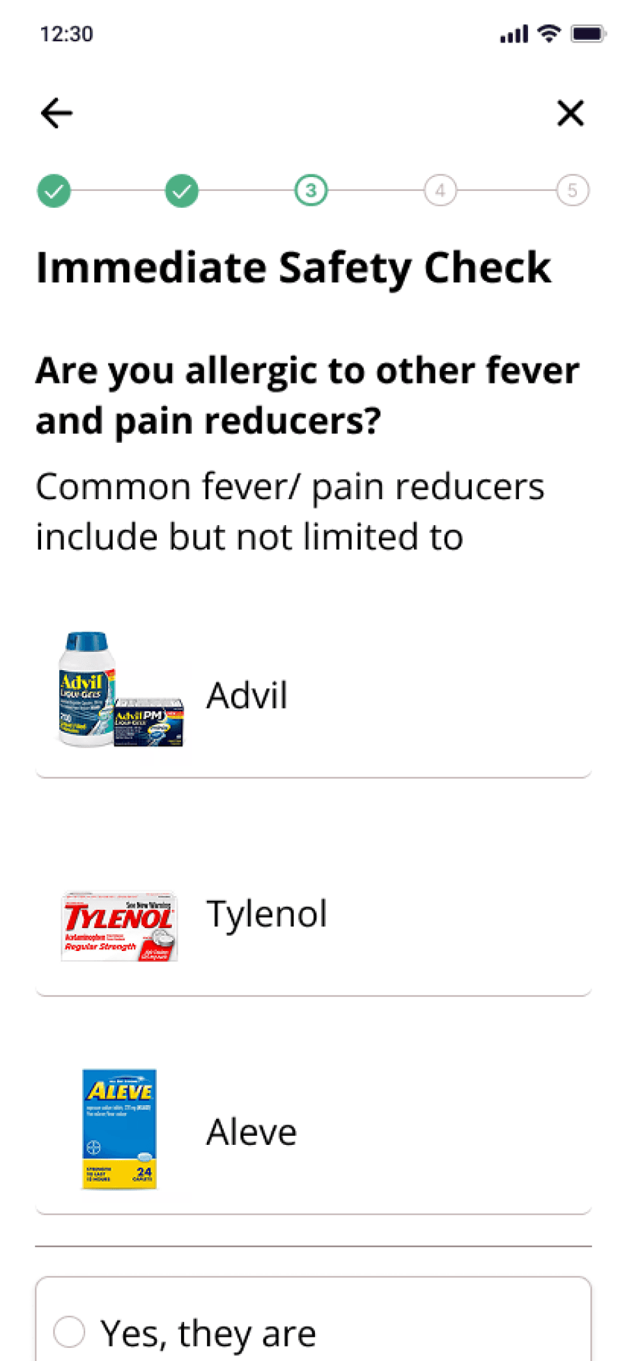
The core design challenge was to take every element of the FDA Drug Facts label and convert it into something a 70-year-old managing multiple chronic conditions could navigate confidently without removing a single data point. The label's content maps to three possible outcomes for any user: safe to take, consult a doctor first, or do not take. That structure became the spine of the questionnaire.
The most critical "do not use" conditions are checked first. If those pass, "consult a doctor" conditions are checked. If those pass, the safe-to-take recommendation is given with a plain-language explanation of why and a clear next step.
Additional information required by FDA guidelines like ingredients, detailed warnings, full directions, etc was converted into FAQ-style cards to preserve readability without cutting content.
DRUG LABEL INFO MAPPED TO PROCESS

Final Recommendation with context
Step based process to arrive at recommendation
IMAGES OVER ICONS
When the app asked users about medications they were already taking, the instinct in most health interfaces is to use generic iconography or text input which assumes users can retrieve medication names accurately on demand.
However, academic literature on designing for older adults pointed consistently toward recognition over recall as a design principle for this population.
I’ve seen my mother, in her forties, describe medications by color, size, and packaging rather than generic or brand name. So instead of just using medication names, I decided to add actual photographs of pill bottles and medications throughout the intake flow, instead of iconography, prioritizing visual recognition instead of name recall.
INITIAL IDEA
Using images when referencing bottles

Providing optional pathways for uncertain situations
Images to boost recognition over recall
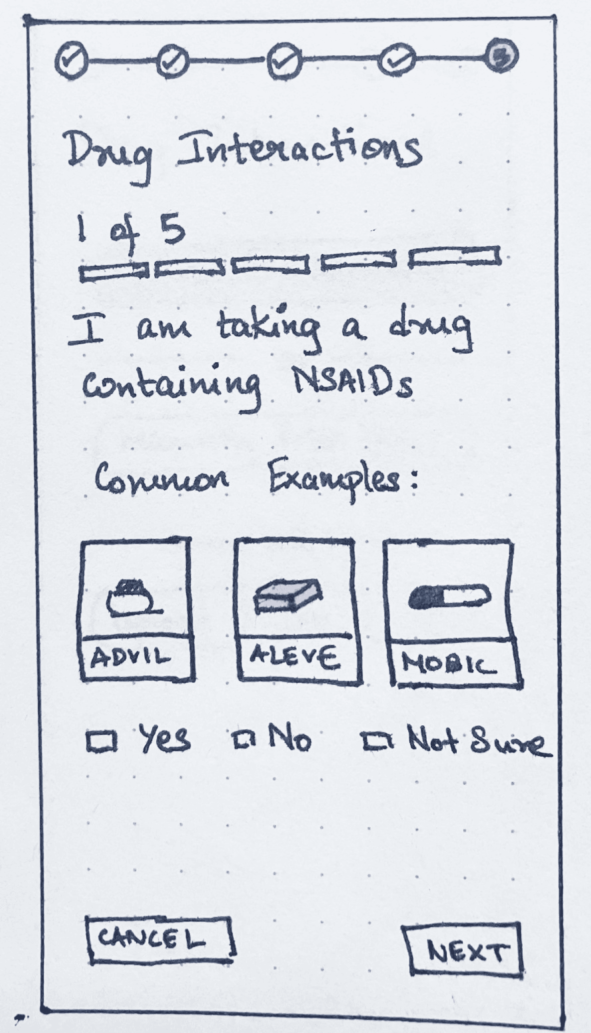
LABEL BASED VS SYSTEM BASED CHECK
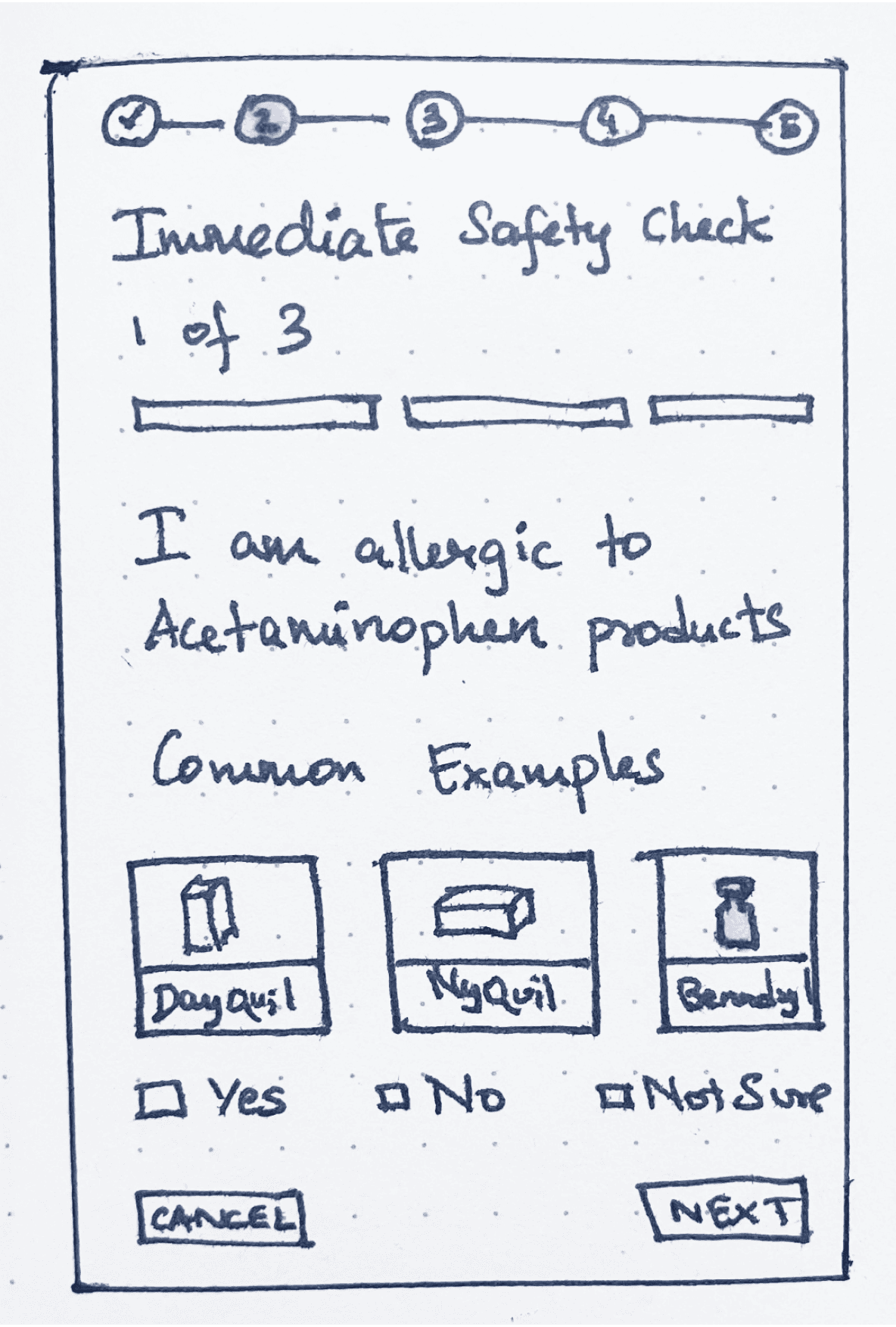
The FDA Drug Facts label presents drug interactions as static warnings, which initially translated into directly asking users about specific contraindications (for example, “Are you taking Drug A?”). While this approach aligned closely with the label, it assumed accurate recall of medication names which is a challenge for older adults managing multiple prescriptions.
An alternative approach shifted this burden from the user to the system: allowing users to input their full medication list and running interaction checks in the background using the RxNav database.
Although only the label-based version was implemented in Phase 1, the system-level approach was presented as a concept during testing. Participants, especially caregivers, consistently preferred this model, citing reduced cognitive load and the benefit of a reusable medication profile. This informed Phase 2 direction toward a persistent, system-driven interaction checker.
INITIAL IDEA
Version A: Question Based
Version B: Upload All + Saved Profile
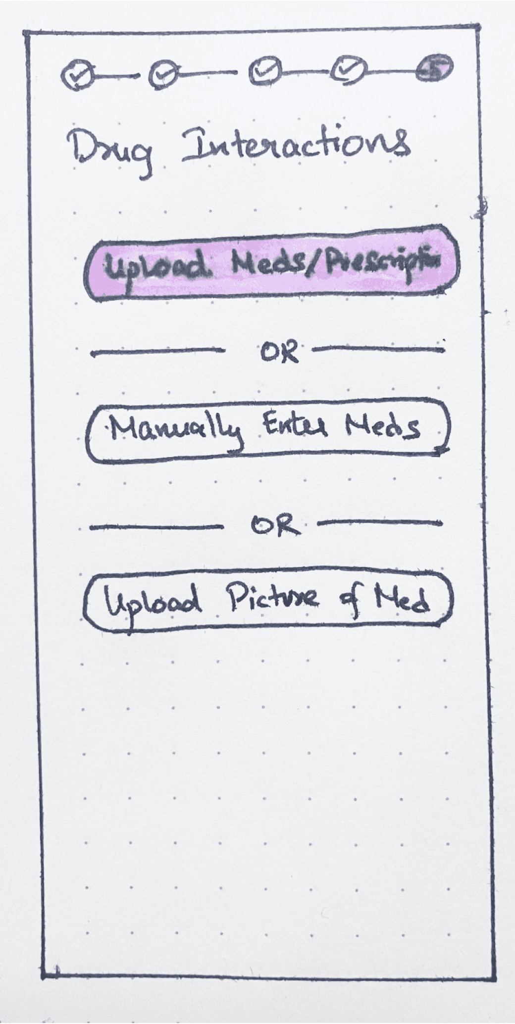

Drug interactions checked on app side with already saved list of drugs
Large iconography and color codes for easier scanability
Reasoning provided in the same page to enable decision making
VERSION TO BE USED IN REDESIGN
FINDINGS
Analysis of the interview data revealed that OTC decision-making among older adults and caregivers follows a staged pattern and not the single-step "read the label" model the Drug Facts format assumes.
Three recurring stages emerged across participants:
01
EVALUATING WHETHER TO MEDICATE AT ALL
Before reaching for a product, participants assessed symptom causes, established personal thresholds for when intervention was warranted, and often chose to tolerate symptoms rather than introduce additional substances.
02
TRANSLATING SYMPTOMS AND CONSTRAINTS INTO A PRODUCT CHOICE
Selection involved reconciling current symptoms against existing medications, chronic conditions, prior experiences, and available information sources. Participants didn't choose based on symptom labels alone but based it on multiple sources simultaneously, often starting with what they already had at home. For caregivers, this reconciliation was significantly more complex: higher risk thresholds, more medications to account for, and greater emotional burden managing decisions for someone else.
03
MANAGING SAFE USE OVER TIME
Dosing wasn't a one-time decision. Participants tracked intervals, adjusted based on observed effects, and coordinated OTC timing against prescription schedules. Timing errors often emerged from routine since once a medication felt familiar, people stopped checking the label. The findings confirm the sequencing logic of the app’s questionnaire flow.
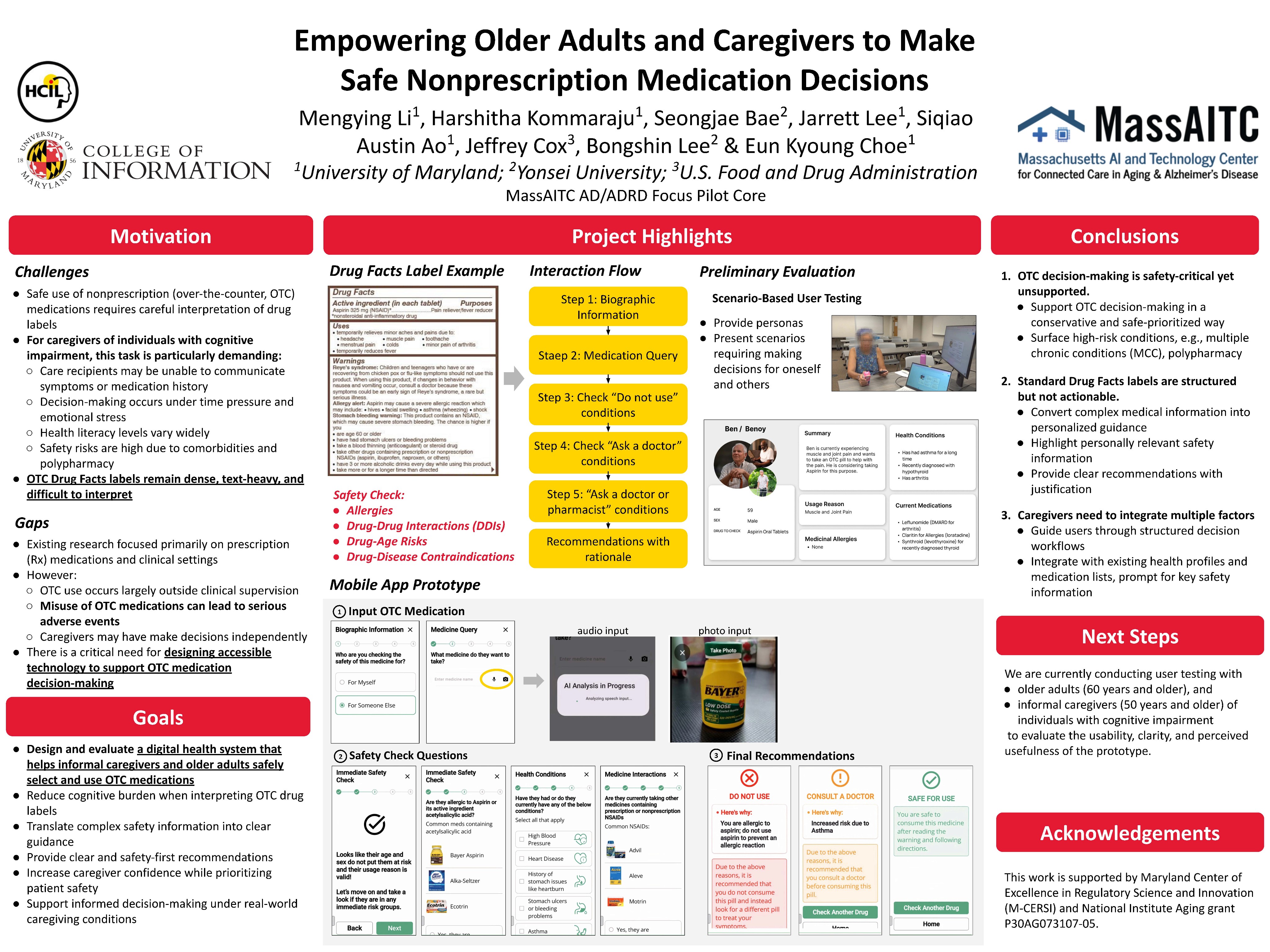
This work was presented as a research poster at the MassAITC AD/ADRD National Symposium, an AI and technology center focused on connected care in aging and Alzheimer's disease. Full paper is currently under review at AMIA 2026.
WHAT’S NEXT
PHASE 01 - COMPLETE
DESIGN + RESEARCH STUDY
App designed and built from best practices. 17-participant study combining contextual interviews and usability testing. Findings submitted to AMIA 2026. Poster presented at MassAITC.
PHASE 02 - IN PROGRESS
REDESIGN DRIVEN BY FINDINGS
RxNav drug interaction checker with persistent medication profiles. Refined helper card system. Interface updates driven directly by usability findings and staged decision-making model.
REFLECTION
The most important constraint on this project was also the most clarifying one: nothing could be removed. Every warning, every direction, every interaction note had to exist somewhere in the interface which made the design challenge about how to sequence information. The design work was translating regulatory completeness into human usability, for a population the original format was never built for.

DESIGNING OTC MEDICATION ASSISTANCE TOOL
ROLE
Lead Research + Sole Designer
STATUS
Paper under review @ AMIA 2026
COLLABORATORS
UMD + Yonsei University + FDA
TIMELINE
Phase 1 complete
PROBLEM
The FDA Drug Facts label is the primary mechanism for communicating OTC medication safety in the United States. It lists active ingredients, warnings, dosing instructions, contraindications, and interaction risks. It is standardized and comprehensive but for older adults navigating polypharmacy, cognitive load, and limited health literacy, it is largely unusable.
A medication decision for this population isn't "read the label." It's a staged reconciliation: Do I even need medication right now? Is this product safe given everything else I'm taking? How do I dose it without harming myself over time? The label presents all of this simultaneously, in dense text, in small print, with no sense of sequence or personal relevance.
THE CHALLENGE
The goal was to convert the static drug label into a process-based interface that maps to how older adults actually make decisions and not how the label assumes they do, in collaboration with Yonsei University and the U.S. Food and Drug Administration.
With one hard constraint that shaped every design choice: nothing on the label could be removed.
THE PROCESS
BEST PRACTICES FIRST. REAL USERS SECOND. REDESIGN THIRD.
Considering older adults managing multiple conditions, caregivers coordinating medications, etc, the stakes were too high and the domain too sensitive to test half-formed ideas. So we decided to build responsibly before initial testing
THE GOAL
Enable older adults to independently make safe decisions regarding OTC meds
Best practice driven research
Using existing literature on designing for older adults to inform design
App Design + Build
Converting drug label information into a user flow adhering to FDA guidelines
Interview + Usability Testing
Conducted rigorous contextual interviews and usability tests
Analysis + Findings
Thematic synthesis of findings about OTC decision making to inform redesign
CURRENTLY AT
Phase 2: Redesign
The design foundation came from the below three sources:
FDA
restrictions, labeling and guidelines
RxNav
Drug interaction database
Literature
on designing for older adults
A mixed methods study was conducted with 17 participants (Older adults and informal caregivers of individuals with cognitive impairment)
Contextual interviews: Real-world OTC decision-making behaviors
Usability testing (4 tasks): think-aloud protocol evaluating the app
Surveys: SUS and SEQ
I conducted 7 of the sessions. Interview and usability data were analyzed separately, then synthesized to connect real-world behavior with in-app interaction patterns to inform redesign.
DESIGN DECISIONS AND WHY?
CONVERTING A
DRUG LABEL INTO A PROCESS
The core design challenge was to take every element of the FDA Drug Facts label and convert it into something a 70-year-old managing multiple chronic conditions could navigate confidently without removing a single data point. The label's content maps to three possible outcomes for any user: safe to take, consult a doctor first, or do not take. That structure became the spine of the questionnaire.
The most critical "do not use" conditions are checked first. If those pass, "consult a doctor" conditions are checked. If those pass, the safe-to-take recommendation is given with a plain-language explanation of why and a clear next step.
Additional information required by FDA guidelines like ingredients, detailed warnings, full directions, etc was converted into FAQ-style cards to preserve readability without cutting content.
DRUG LABEL INFO MAPPED TO PROCESS


1
Step based process to arrive at recommendation
2
Final Recommendation with context
IMAGES OVER ICONS
When the app asked users about medications they were already taking, the instinct in most health interfaces is to use generic iconography or text input which assumes users can retrieve medication names accurately on demand.
However, academic literature on designing for older adults pointed consistently toward recognition over recall as a design principle for this population.
I’ve seen my mother, in her forties, describe medications by color, size, and packaging rather than generic or brand name. So instead of just using medication names, I decided to add actual photographs of pill bottles and medications throughout the intake flow, instead of iconography, prioritizing visual recognition instead of name recall.
INITIAL IDEA
Using images when referencing bottles


1
Images to boost recognition over recall
2
Providing optional pathways for
uncertain situations
LABEL BASED VS SYSTEM BASED CHECK
The FDA Drug Facts label presents drug interactions as static warnings, which initially translated into directly asking users about specific contraindications (for example, “Are you taking Drug A?”). While this approach aligned closely with the label, it assumed accurate recall of medication names which is a challenge for older adults managing multiple prescriptions.
An alternative approach shifted this burden from the user to the system: allowing users to input their full medication list and running interaction checks in the background using the RxNav database.
Although only the label-based version was implemented in Phase 1, the system-level approach was presented as a concept during testing. Participants, especially caregivers, consistently preferred this model, citing reduced cognitive load and the benefit of a reusable medication profile. This informed Phase 2 direction toward a persistent, system-driven interaction checker.
INITIAL IDEA
Version A: Question Based

Version B: Upload All + Saved Profile


1
Drug interactions checked on app side with already saved list of drugs
2
Large iconography and color codes for easier scanability
3
Reasoning provided in the same page to enable decision making
FINDINGS
Analysis of the interview data revealed that OTC decision-making among older adults and caregivers follows a staged pattern and not the single-step "read the label" model the Drug Facts format assumes.
Three recurring stages emerged across participants:
01
EVALUATING WHETHER TO MEDICATE AT ALL
Before reaching for a product, participants assessed symptom causes, established personal thresholds for when intervention was warranted, and often chose to tolerate symptoms rather than introduce additional substances.
02
TRANSLATING SYMPTOMS AND CONSTRAINTS INTO A PRODUCT CHOICE
Selection involved reconciling current symptoms against existing medications, chronic conditions, prior experiences, and available information sources. Participants didn't choose based on symptom labels alone but based it on multiple sources simultaneously, often starting with what they already had at home. For caregivers, this reconciliation was significantly more complex: higher risk thresholds, more medications to account for, and greater emotional burden managing decisions for someone else.
03
MANAGING SAFE USE OVER TIME
Dosing wasn't a one-time decision. Participants tracked intervals, adjusted based on observed effects, and coordinated OTC timing against prescription schedules. Timing errors often emerged from routine since once a medication felt familiar, people stopped checking the label. The findings confirm the sequencing logic of the app’s questionnaire flow.
This work was presented as a research poster at the MassAITC AD/ADRD National Symposium, an AI and technology center focused on connected care in aging and Alzheimer's disease. Full paper is currently under review at AMIA 2026.
WHAT’S NEXT
PHASE 01 - COMPLETE
DESIGN + RESEARCH STUDY
App designed and built from best practices. 17-participant study combining contextual interviews and usability testing. Findings submitted to AMIA 2026. Poster presented at MassAITC.
PHASE 02 - IN PROGRESS
REDESIGN DRIVEN BY FINDINGS
RxNav drug interaction checker with persistent medication profiles. Refined helper card system. Interface updates driven directly by usability findings and staged decision-making model.
REFLECTION
The most important constraint on this project was also the most clarifying one: nothing could be removed. Every warning, every direction, every interaction note had to exist somewhere in the interface which made the design challenge about how to sequence information. The design work was translating regulatory completeness into human usability, for a population the original format was never built for.
OPEN TO WORK
LET’S CONNECT!
Let's make something
worth remembering :)